In CSS specifications, the float property is very interesting. The property indicates that an element is to be removed from the normal flow and instead be placed into a different place - currently, on the right or left side of its container. Text and other inline elements will then surround the floated element.
Layout is the operation of positioning and styling elements of content in a given space. It aims to position the content (text, images, notes…) in a hierarchical and harmonious way (balancing the zones, colors and spaces, contrasts), in order to facilitate display and the flow of reading.
Layout is more complex than the flow of content from one page to the next with appropriate elements of stylization. Each page must be balanced and provide for pleasant reading. To achieve this, we need to position elements in relation to the flow of text but also in relation to the page as well. Elements will have text wrapped around them to manage a pleasing allocation of white space and avoid creating widows and orphans.
In CSS specifications, the float property is very interesting. The property indicates that an element is to be removed from the normal flow and instead be placed into a different place – currently, on the right or left side of its container. Text and other inline elements will then surround the floated element.
In its simplest use, the float property can be used to wrap text around images. This property can take four values: left | right | inherit | none.
New properties (float-reference, float-defer) and values (for float and clear properties) have recently been proposed in the W3C working draft CSS Page Floats. These properties add further ways of refining layouts and that’s what we are going to look at in this post. We also propose additional new extension values, based on what has already been proposed in proprietary tools such as Vivliostyle, Prince, PDFReactor and AntennaHouse.
Paged.js is not yet supporting page-float, this article is there to help define the implementation and the future work.
Float reference and float properties
The float specification first needs to be established in reference to some default value or position. e.g. “The entity to which the float is aligned initially before float placement takes place” (CSS Page Floats).
To do this, we need two properties:
float-referenceallows the definition of a specific entity as the reference to which the element is moving. The float reference can be the float anchor’s line box, column, region or page; andfloatis used to specify where the element will move in relation to this new reference.
A simple example will make this clearer. In this example, initially, a figure is positioned around the middle of the page. We want to move the image to the top of the page. For this, we define the page as our float reference and we use the values top as following :
figure { width: 100%; float-reference: page; float: top }
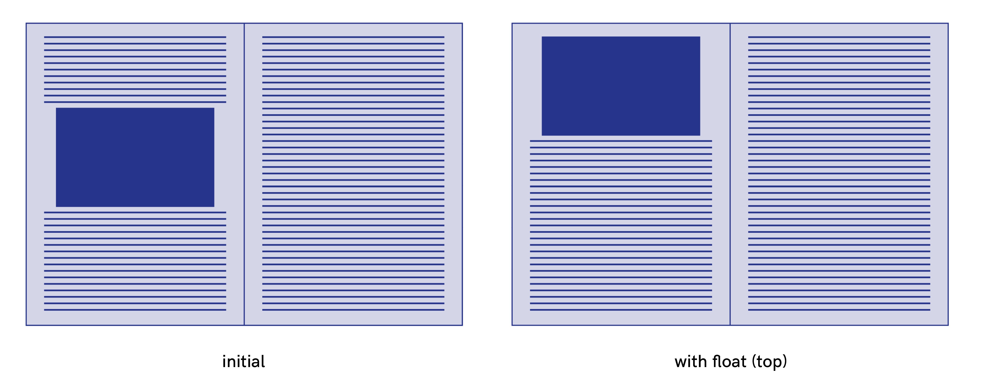
The float property (W3C specifications)
For the float property, the W3C draft specifications propose the following values : block-start | block-end | inline-start | inline-end | snap-block | snap-inline | left | right | top | bottom | none
There are two types of values that I separate into two categories I call “floats XY” and “floats AB”.
Floats XY
left | right | top | bottom
These values are interpreted relative to the page, independently of writing mode. Their physical directions correspond to the x-axis (horizontal dimension) and y-axis (vertical dimension) of the page.
Floats AB
block-start | block-end | inline-start | inline-end | snap-block | snap-inline
These values are interpreted relative to the flow of content. There are abstract directional and dimensional calculated directly from the values of the writing-mode and direction properties.
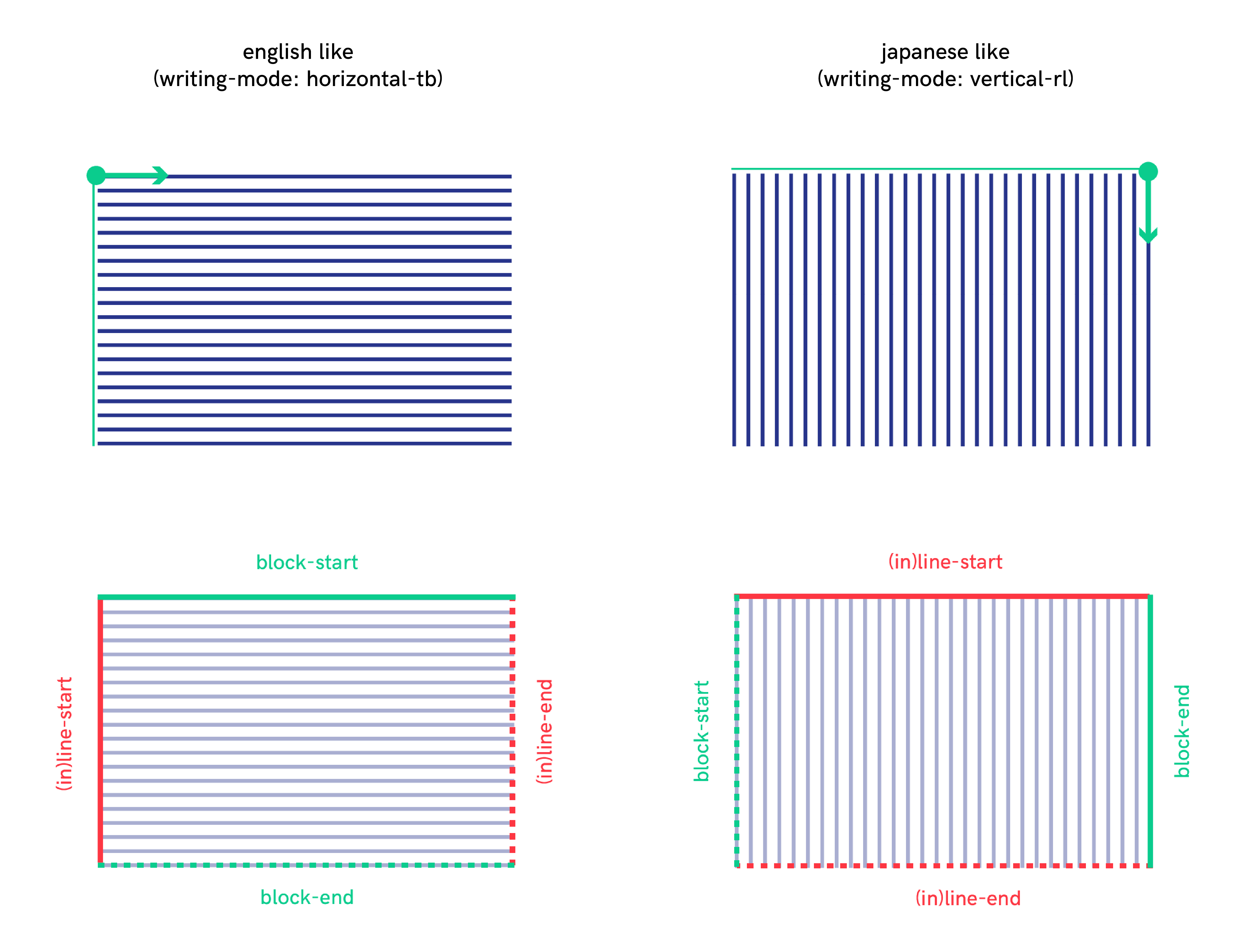
These flow-relative directions, block-start | block-end | inline-start | inline-end, are defined in the W3C recommendation CSS Writing Modes Level 3 as follows:
- block-start : “The side that comes earlier in the block flow direction, as determined by the writing-mode property: the physical top in horizontal-tb mode, the right in vertical-rl, and the left in vertical-lr.”
- block-end : “The side opposite block-start.”
- inline-start : “The side from which text of the inline base direction would start. For boxes with a used direction value of ltr, this means the line-left side. For boxes with a used direction value of rtl, this means the line-right side.”
- inline-end : “The side opposite inline-start.”
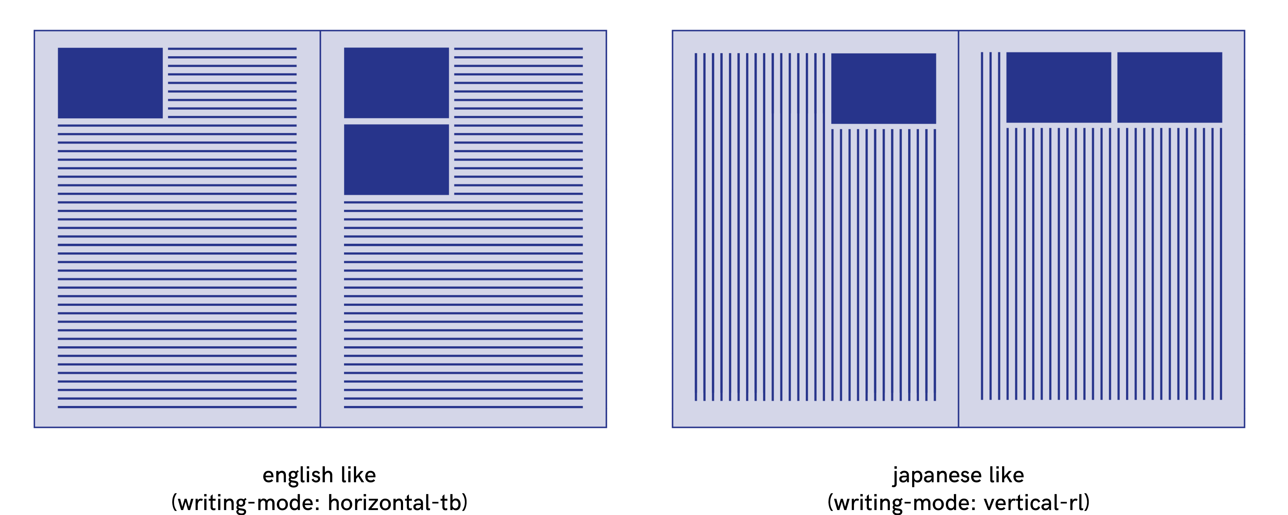
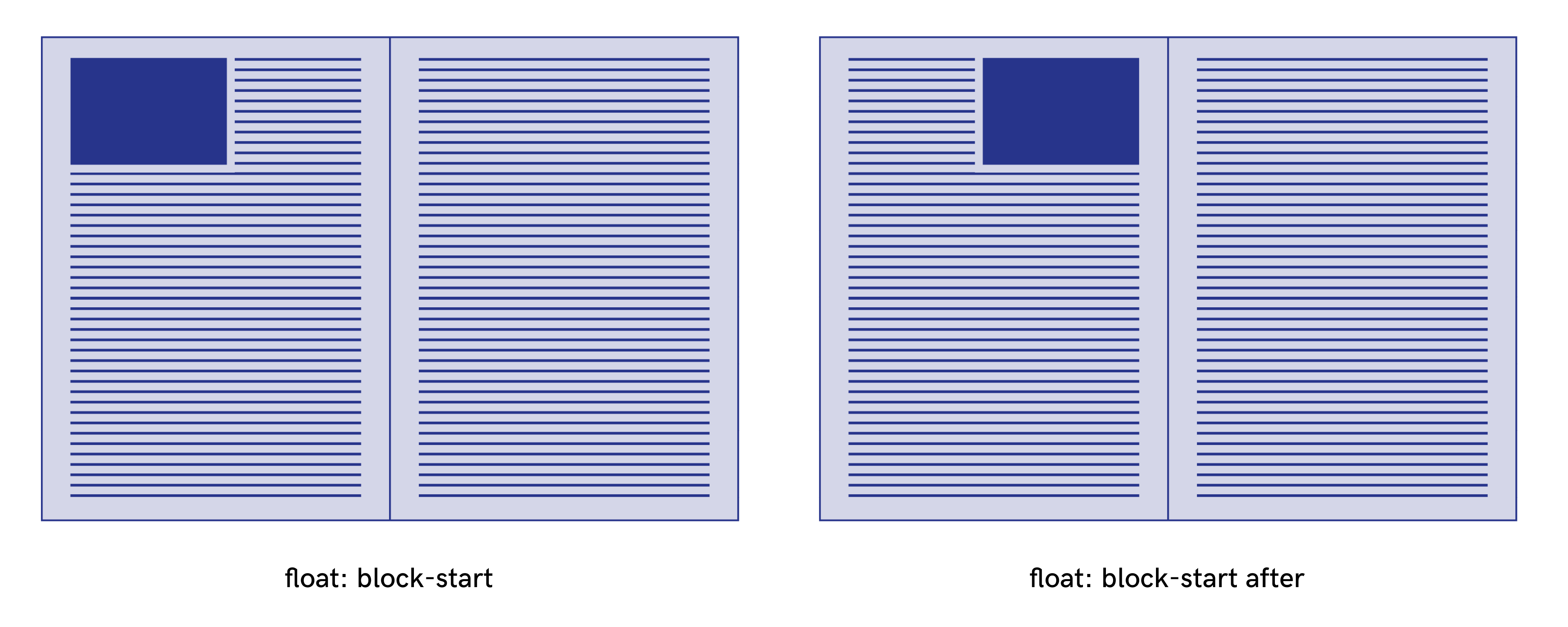
So, the block-start float value gives a different result if it’s applied to elements contained in an entity with different writing-mode and direction properties. According to the specifications of the W3C working draft CSS Page Floats, with the block-start float value, “the element generates a box that is floated to the line-start outer edge of the float reference. Content flows on the line-end side of the box.” This gives the following results:
Avoiding white spaces
It often happens that an element ends up at the bottom of a page but is too big to fit within the page height, so the element is automatically pushed to the next page with a forced page break. This produces a gap, a white space, at the end of the previous page. It’s unsightly and, moreover, the reader might think that it means the end of a section. The float property can fix this problem.
In the following example, the figure is already at the nearest edge, so it does not move. However, floats allow subsequent content to be displayed before the float and the white space can therefore be filled.
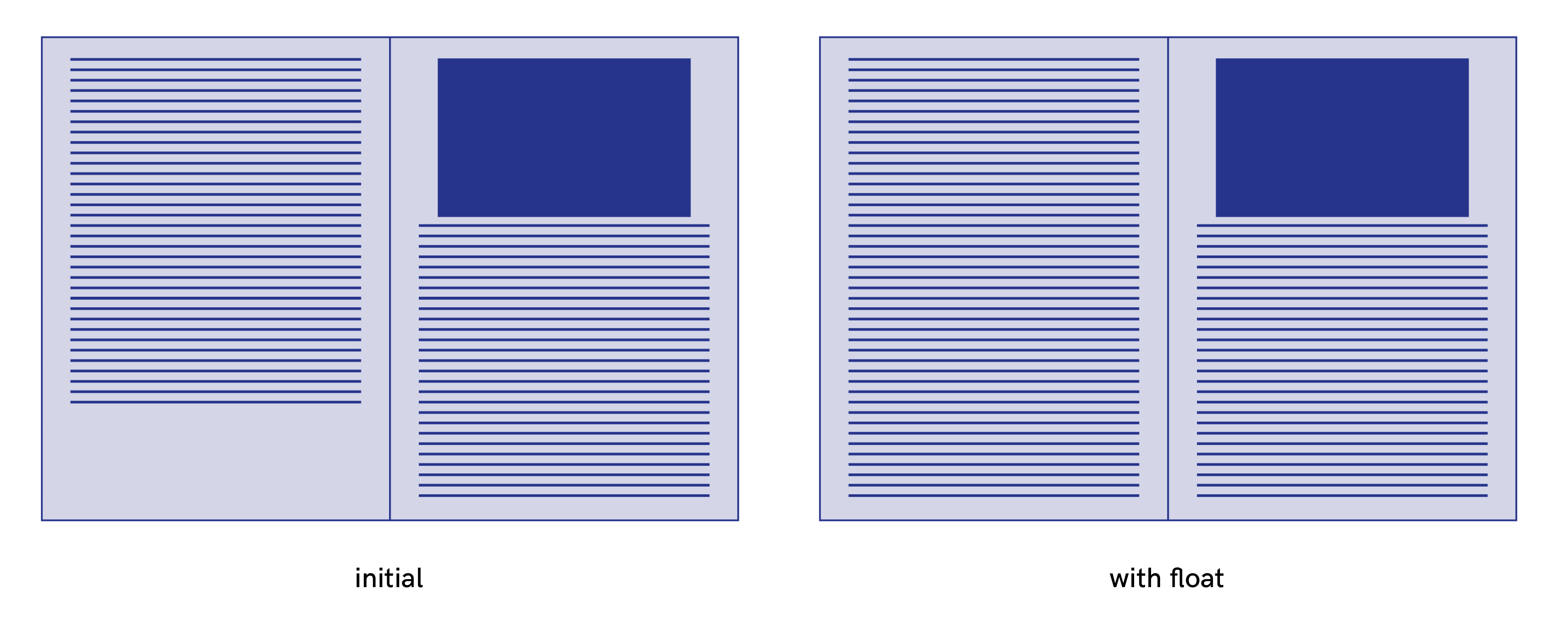
Note that in Prince, the proprietary optional modifier unless-fit is to be used in combination with other float instructions, and is conditional: the element is only floated if it would otherwise cause a page.
element {
    width: 100%;
    float: top unless-fit
}
The snap-block value
The snap-block(<length> [, start | end | near ]?) value and the snap-inline(<lengtht> [, start | end | near ]?) values specify than an element floats to the start or the end of the block if it naturally appears within a certain distance from either one.
The length value specifies the reach of the snap function, e.g. the maximum distance from the start/end that an element must be within in order to be floated.
“The length value specifies the distance from both the start and the end, two length values specify the distance from the start and end, respectively. The optional keyword value specifies where the element is floated: start, end, or the nearest of the two. The initial value is near. If near is in effect and the element is within the specified distance both from the start and the end, end wins.” (W3C specifications)
In this example the first element is affected, but not the second :
element {
    float-reference: page;
    float: snap-block(2em near)
}
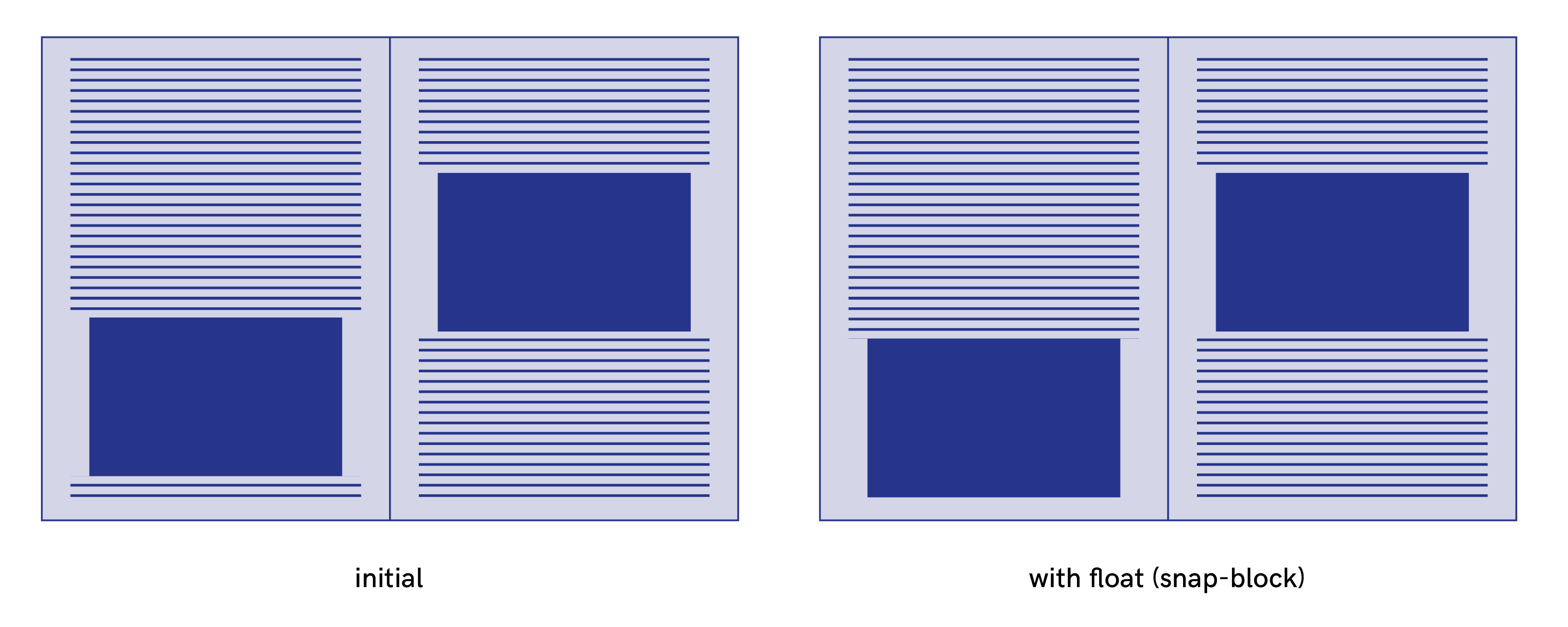
An element with the snap-block() value is considered to be a float even if the element does not appear within the specified distance. In this case, the element floats at the start / end line, but not at the start, nor at end of the block.
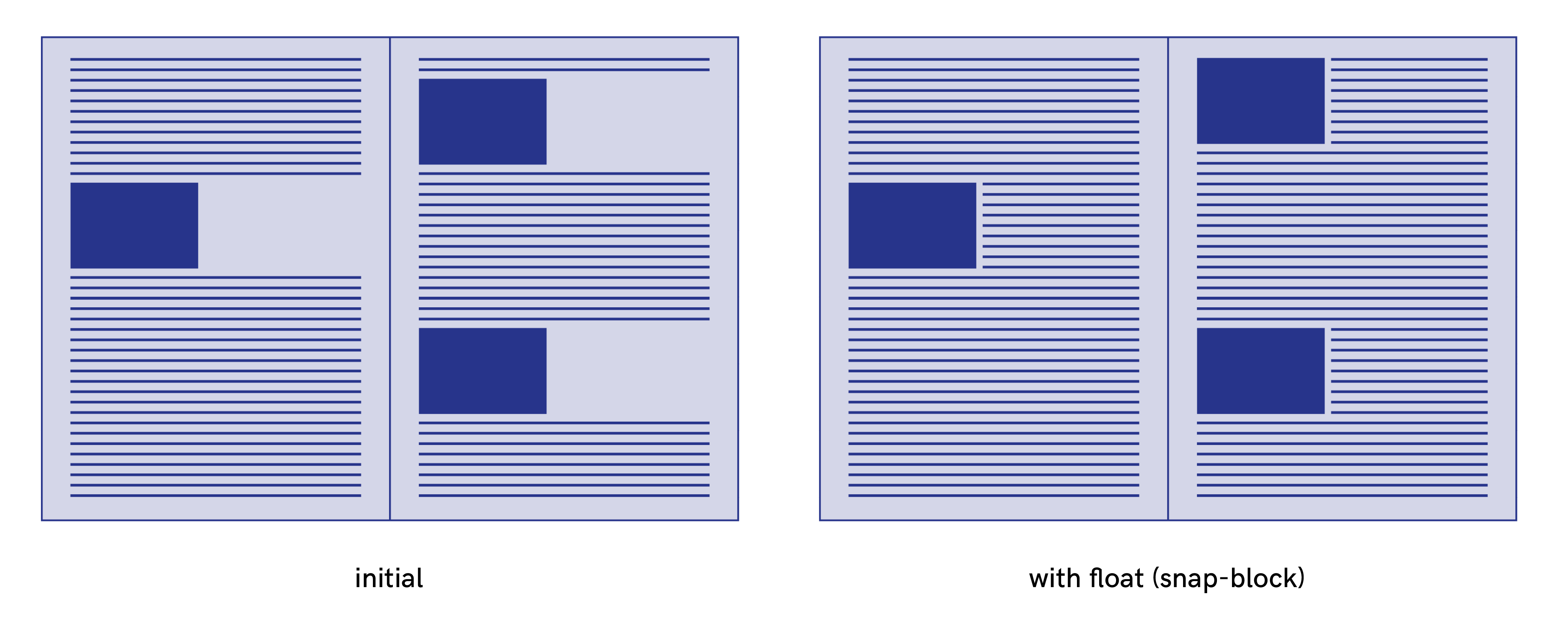
The snap-block and the snap-inline values correspond respectively to snap-block(2em, near) and snap-inline(2em, near). It can be very useful to apply this float property to move an element to the top of the next page unless it fits on the current page without causing a break and leaving a gap, or without causing a widow or orphans.
Extensions proposals for pagedmedia specs
Although the W3C draft extends the possibilities for float values, they are still limited and some layouts are still not possible. In this part, I want to propose new extension values, sometimes based on what has already been proposed by some proprietary tools.
Combinations of XY directions
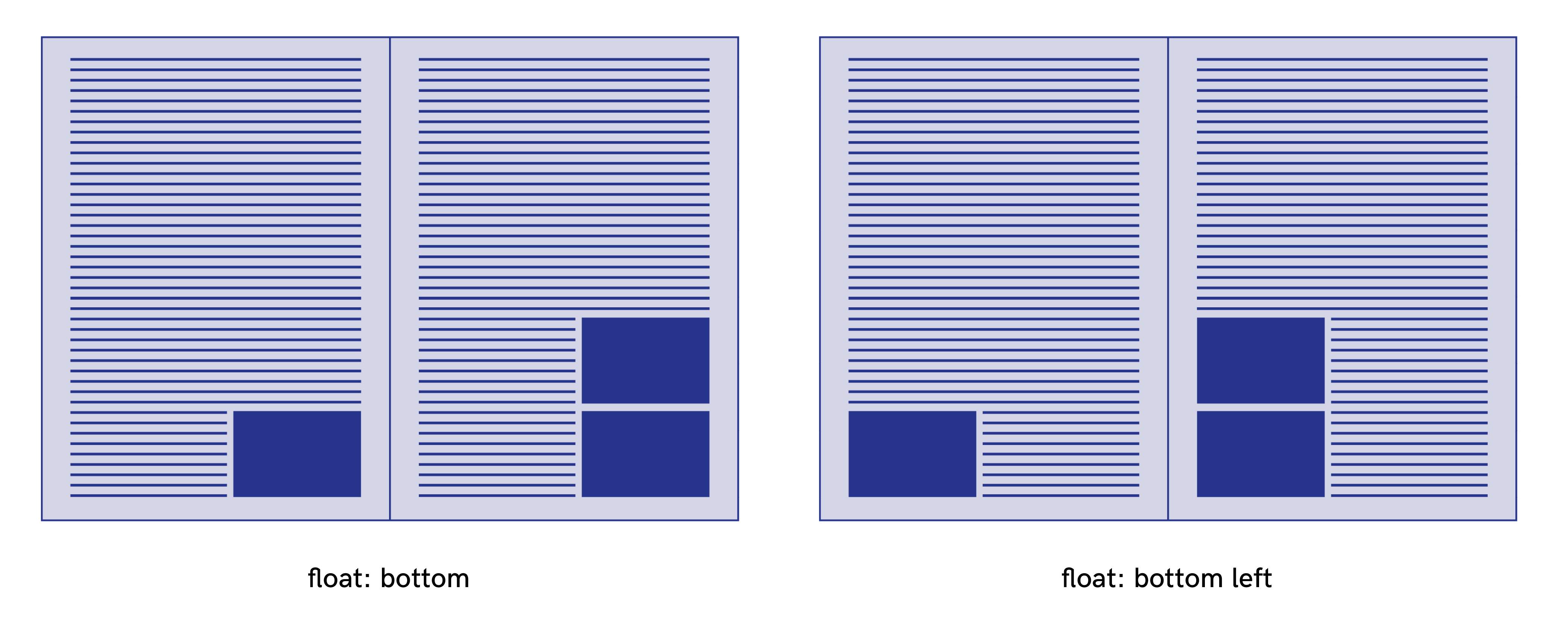
In the W3C draft, there is currently no way to float into a combination of directions (top right, right top, left bottom, bottom left, etc.) but it’s possible in Antenna House. For example, with float: bottom left, the element goes to the left bottom corner of the page. It’s a very interesting extension which allows more possibilities for layout.
Inside and outside values
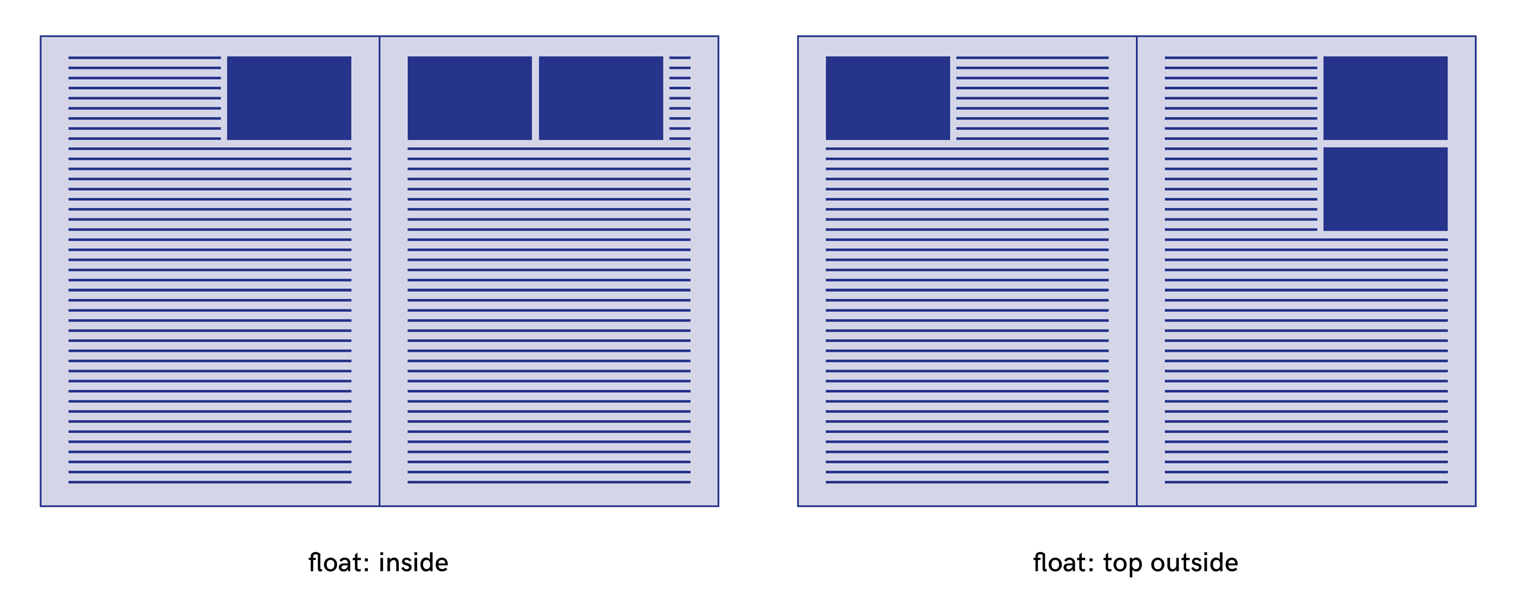
The values inside and outside are very useful in print because we often have to deal with left-facing and right-facing pages, together forming a spread. These values can be found in Prince or AntennaHouse and are interpreted relative to the page (floats XY), moving the elements respectively to the inside or outside of a spread:
- with the
insidefloat value, an element can be floated at the left side on a right page and at the right side on a left page. - with the
outsidefloat value, an element can be floated at the right side on a right page and at the left side on a left page.
After and before
The values after and before are a new proposal which can be added to the list of floats interpreted relative to the flow of content (floats AB). They indicate that the content flows respectively on the block-start and the block-end side of the box. These values can be used in combination with the other “float AB” values to force the side of the content flow.
UPDATE (7/04/2018)
Shinyu Murakami (Vivliostyle) noted in a comment of this article that after and before keywords were used in the W3C’s old logical (flow relative) direction terminology (W3C XSL-FO). inline-start and inline-end would probably be a better choice of keywords and fit closer the new W3C logic. We will adopt this terminology for the future. In the example above block-start after is transformed into block-start inline-end. The following demo has been updated.
Need to extend the float property
In summary, if we take all the proposals that have just been detailed in this part, we can propose a global syntax for the float property:
float: none | [<float-x> || <float-y>] || [<float-a> || <float-b>]
with :
<float-y> = top | bottom<float-x> = left | right | inside | outside<float-a> = block-start | block-end | inline-start | inline-end | snap-block(<length> [, start | end | near ]?) | snap-inline(<length> [, start | end | near ]?)<float-b> = before | after
I have made a little demonstrator to show all the possibilities of this proposal with the application of these additional different kinds of floats: http://demos.pagedmedia.org/page-floats/

Multicolumn layout
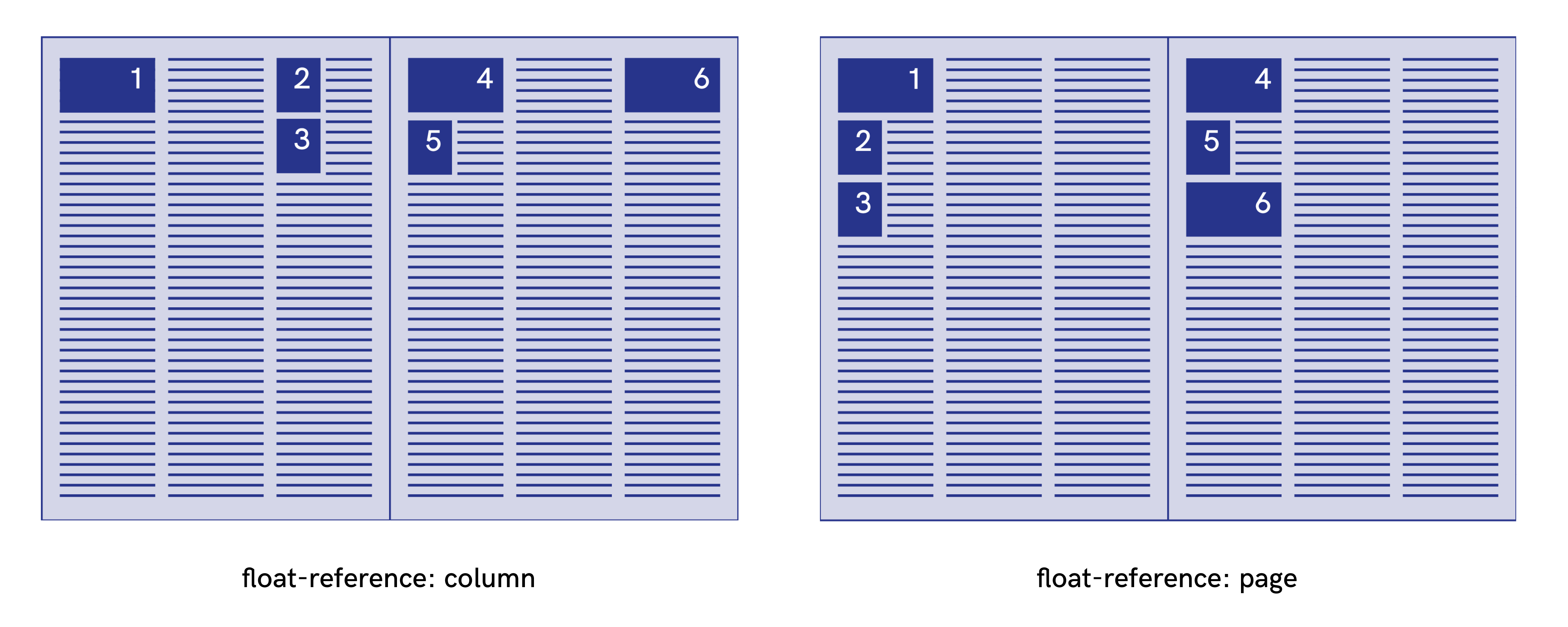
In multicolumn layouts, the float-reference property float-reference: column can be used. The floated elements will be placed according to the column which contains the float anchor, e.g. the point in the flow where the floated element would have appeared had it not been a float and instead had been an empty inline element with no margins, borders or padding.
It’s still possible to use float-reference: page in multicolumn layouts. In this case, the same element with the same float value will be placed differently according to its float reference.
Column span
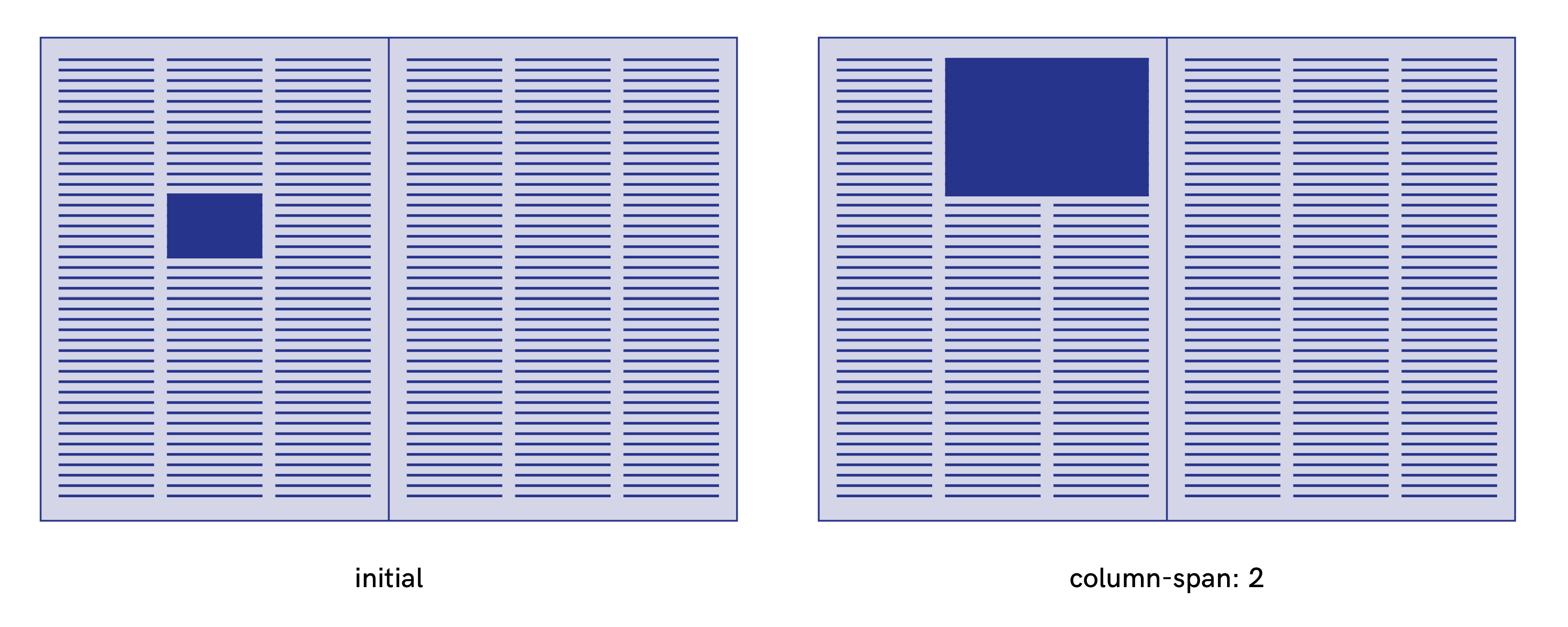
The column-span property allows an element to span all columns when the value of the property is all. An element that spans more than one column is called a spanning element. This is useful for titles which break the flow of the columns and span several columns.
Generally, in the tools explored for this article, an integer value is added for specifying how many columns an element should span across. This possibility is not available for now in the current draft of W3C but it’s very useful in combination with float properties for creating layouts such as those used in newspaper formats.
    body {
        column-count: 3
    }
    img {
        column-span: 2
        float-reference: column
        float: top
    }
Clear property
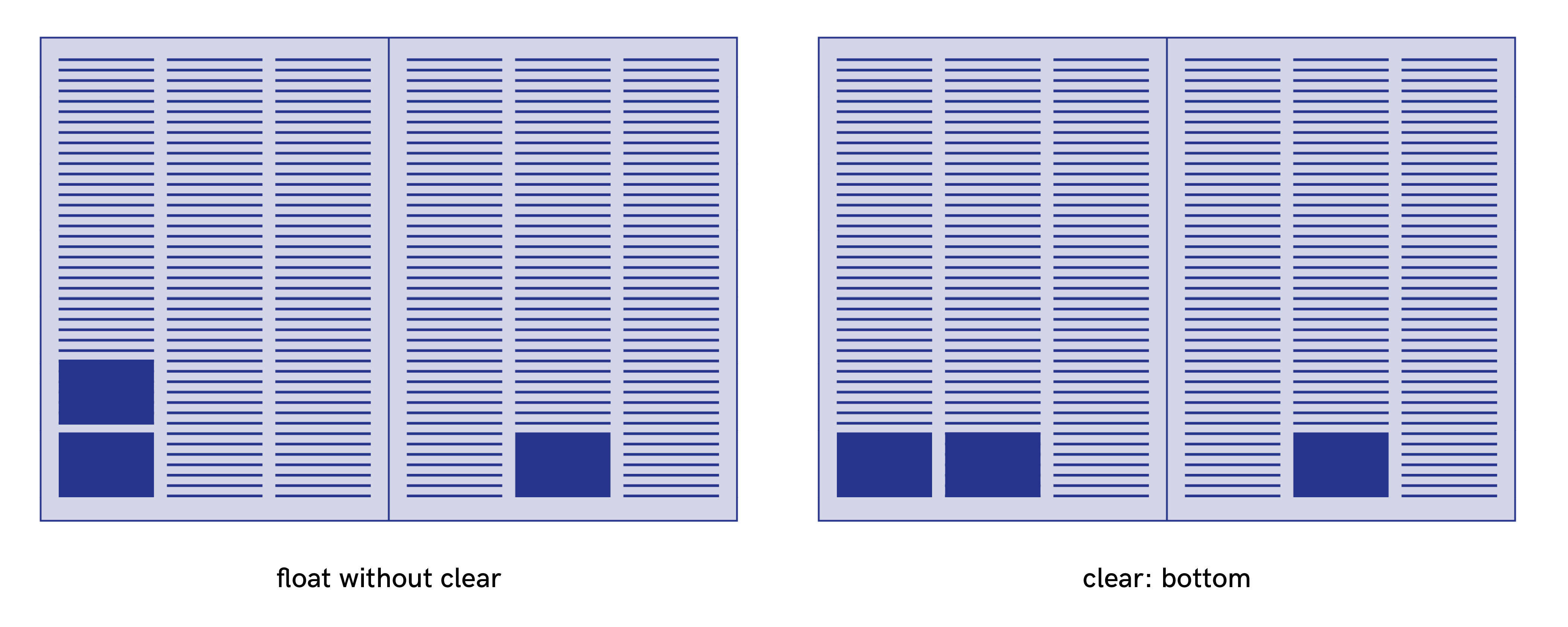
The clear property can be used to prevent stacking of floats. The possible values are the same as the float property, only the snap-block() and snap-inline() values are not available.
The clear property indicates whether an element can be located next to floating elements that precede it (according to the direction indicated by the clear value) or if it needs to be moved in the next float reference container.
With the code that follows, a figure can’t have another figure below it the same page. If another figure has its float anchor in the same page, this figure will appear in the next page when rendering.
figure {
  float-refrence: page;
  float: bottom left;
  clear: bottom;
}
float-defer property
With the float-defer property, a floated element can be deferred to a subsequent fragmentation container. This property works with an integer value or with the keyword last: “This property specifies whether the initial float reference of a page float is the fragmentation container in which the float anchor is placed after previous page floats have been placed, or in another one.” (W3C specifications)
An “n” positive integer value indicates that the element is deferring to the Nth fragmentation container of the “fragmentation flow” after the float anchor is initially placed (after all previous page floats have been placed within the given fragmentation context).
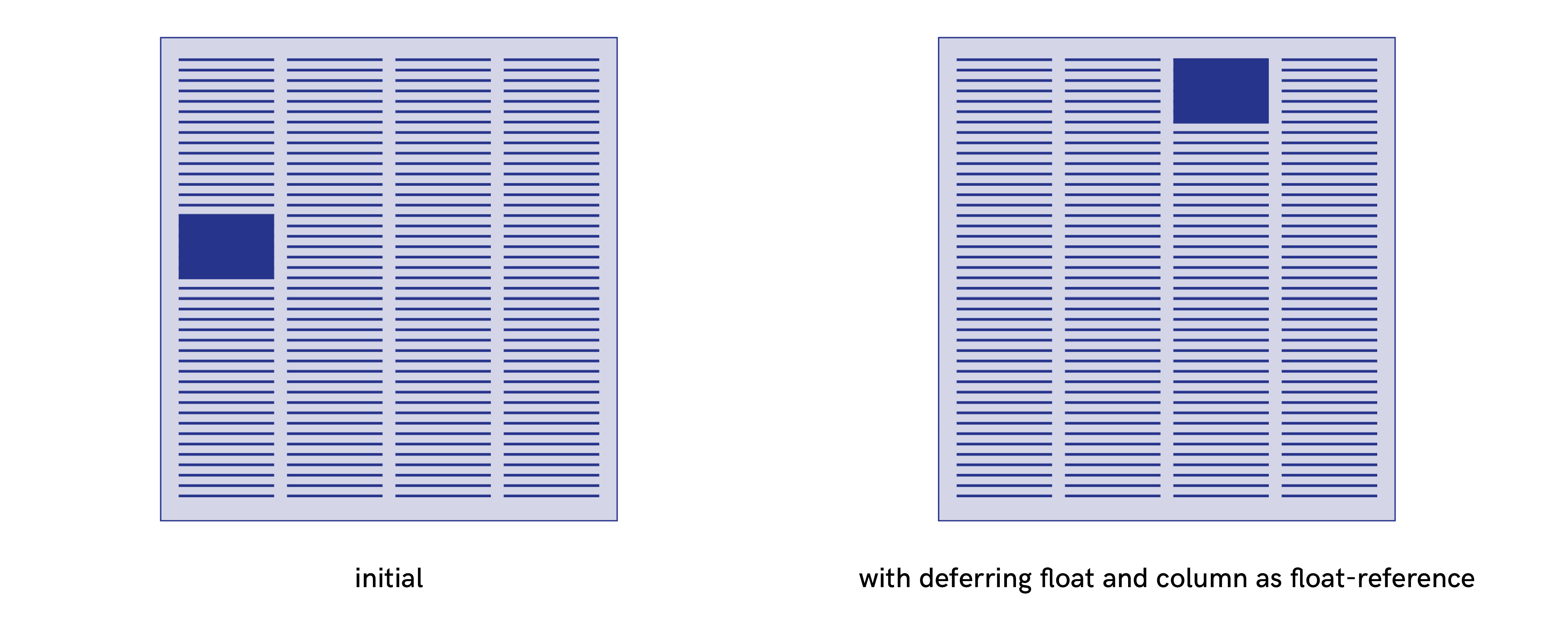
An “n” negative integer value indicates that the element is deferring to the Nth fragmentation container of the “fragmentation flow” counting backward from the end. If the float reference of the deferring element is the page, the count starts on the last page of the flow section of the named page where the initial float anchor appeared. If the float reference of the deferring element is the column, the count starts on the last page column of the page where the initial float anchor appeared.
figure {
  float-reference: page;
  float: top;
  float-defer: 1;
}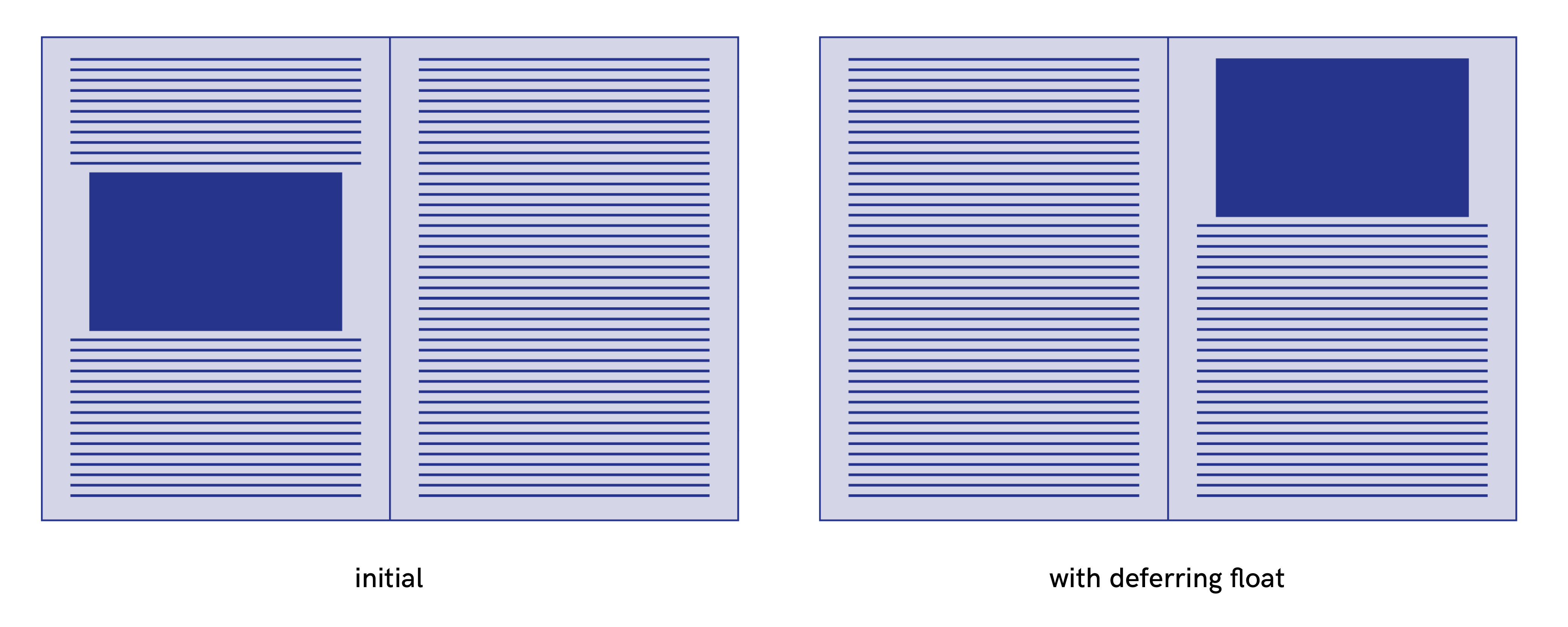
figure {
  float-reference: column;
  float: top;
  float-defer: -2;
}
These properties don’t work on any of the tools tested. However, in Prince and Antenna House, the next value is added to the float property: the floated element is placed on the next fragmentation container from its source location.
In conclusion
The large number of values proposed by the W3C Working Draft CSS Page Floats makes it possible, through the combination of properties, to imagine a large number of use cases and therefore to start expressing rich layouts.
The implementation of this specification depends on the tool, but overall they are rather limited.
- Browsers haven’t implemented anything.
- Prince and Antenna House have their own proprietary values for the
floatproperties, including some that run across those of the W3C specifications. - Vivliostyle have implemented
float-referenceandfloatproperties very well. Johannes Wilm, the specification’s editor, is a member of the Vivliostyle Project Community clearandfloat-deferare yet not implemented anywhere.
The CSS Page Floats specifications and the extensions proposed in this post are good candidates for increasing opportunities for the PagedMedia initiative. This would be interesting not only for the placement figures but also for augmented uses such as the two following examples on which I end this post.
Full page image
figure .full-page {
  height: 8in; /* height of the page */
  float: top;
  float-reference: page;
  position: relative;
  top: -0.8in; /* margin top of the page */
  left: -0.8in; /* left margin of the page */
}
Inserts in margins
.inserts {
  width: 30mm;
  margin-outside: -38mm;
  float-reference: page;
  float: top outside;
}