While it is easy to imagine a multilingual book that would share its pages to accommodate content in two languages, it has always been difficult to imagine the web other than this long vertical flow, heir to the wheel. The content of a page starts at the top, and ends, when there is no more content to be placed on the page, well below what the screen shows, giving each illusion of infinity, what the attention economists have well integrated into their tools.
In reality, we have imagined some subterfuges to offer a semblance of parallel flow, from the layout through the `table' to the appearance of CSS or Flex grids, but it is always about the same downward movement, and even if the magic trick is invisible, because remarkably realized, it comes to mind when we wish to translate it on a paginated media.
The unfulfilled promise of CSS regions
When W3C editors work on the specifications for print, the web is not yet a world of web apps, of overpowered CSS and layout automation. We barely get out of the <table> layouts and we’re just discovering the wonderful world of floats. It is still The web of the document for which a page has a beginning (top) and an end (bottom). Suffice to say that when one thinks about printed matter, they do not look much further than to cut this flow into a sequence of pages until to form, for the most insane minds, a book.
Well, in fact, there have been attempts, one of which has been quite extensive: the CSS regions. This technique allowed the definition of spaces in which previously dissociated content streams could flow into the HTML code. And it was all but simple: the HTML was divided into two parts: on one hand the content, and on the other hand the container, associated with a complex CSS that defined the positioning of the boxes, and the shape of their contents. Yes that sentence was as complex as using css regions was. I will not go back here to the reasons why people in Chromium gave up the idea, because it would be too long and subject to so much controversy that we would lose the day (and a little mental health) arguing.
Just know that, within a few years, we had CSS regions in Chrome and we knew how to use them, and we made amazing things with it.
Moreover, Open Source Publishing, to which the CSS Print owes a great deal, has shown more than once the interest of such a practice. I think the best example comes from The Riddle.
And CSS Grid was.
If you look at the CSS presentation videos, the ones produced to push them into adoption, you always find the idea that it is about finding artifices of layouts that come from the book. And especially graphic experiments that come straight from the magazine press.
The CSS grid is the total step of the separation between the content and its form. If before these properties, the HTML was to give the order according to which items should be displayed on the page, this is not necessarily the case today, since the CSS offers authors the possibility to define, in addition to their form, the positioning and order of these contents.
The simplest way to look at a CSS grid is to see a touch-and-tip tray. To place each vessel, simply give its horizontal and vertical coordinates on a 2D grid. Therefore, the reading order is no longer descending, it is multiple, and depends on the organization of the page induced by the CSS.
However, the CSS grid has a fundamental limitation: no element can be separated into two blocks from this grid. The following image shows something impossible in CSS:
The print as a Trojan horse
The good thing about CSS print is that unlike the web, we are working on a page with limited dimensions, and that it is up to us to make the graphic and typographical decisions that allow the cutting of a long text into an infinity of smaller ones. Even if the W3C specifications show that questions have arisen and answers may have appeared, it is certain that the translation into print is an understatement of the evolution of the web.
First because print is only a limited use of our digital life and then because it would pose a thorny question: if we do it for a paginated media, why don't we do it for the web? If a printed CSS grid should allow the cutting of content on several cells, then why can't we afford it on the screen?
An interesting thing to do when a practice does not seem to exist on the web is to invest the field and start thinking about solutions, abstract enough to be reusable and clear enough to be explained, commented and analyzed.
The question of multiflux is difficult whatever the media, but it is the paginated media that seems to need the most answers, since unlike the screen, the paper is not infinite. Hence, here is a feedback on the multiflux in paged.js, organized around the project Screen Paper Edit, (EPE), led by l'Esad Grenoble / Valencia.
As part of the project, designers needed a solution to put texts in several languages and deal with them in the same way, avoiding placing one before the other. Perfect starting point to put the question of CSS regions on the table, now that CSS grids have become a central tool in web design habits.
pagedjs-multiple-flows.0.1d.js
If you want to take a look at the code first, it is here: parallel-flows. As i’m writing this, we’re on version 0.1d, working with paged.js 0.4.3 and 0.5b
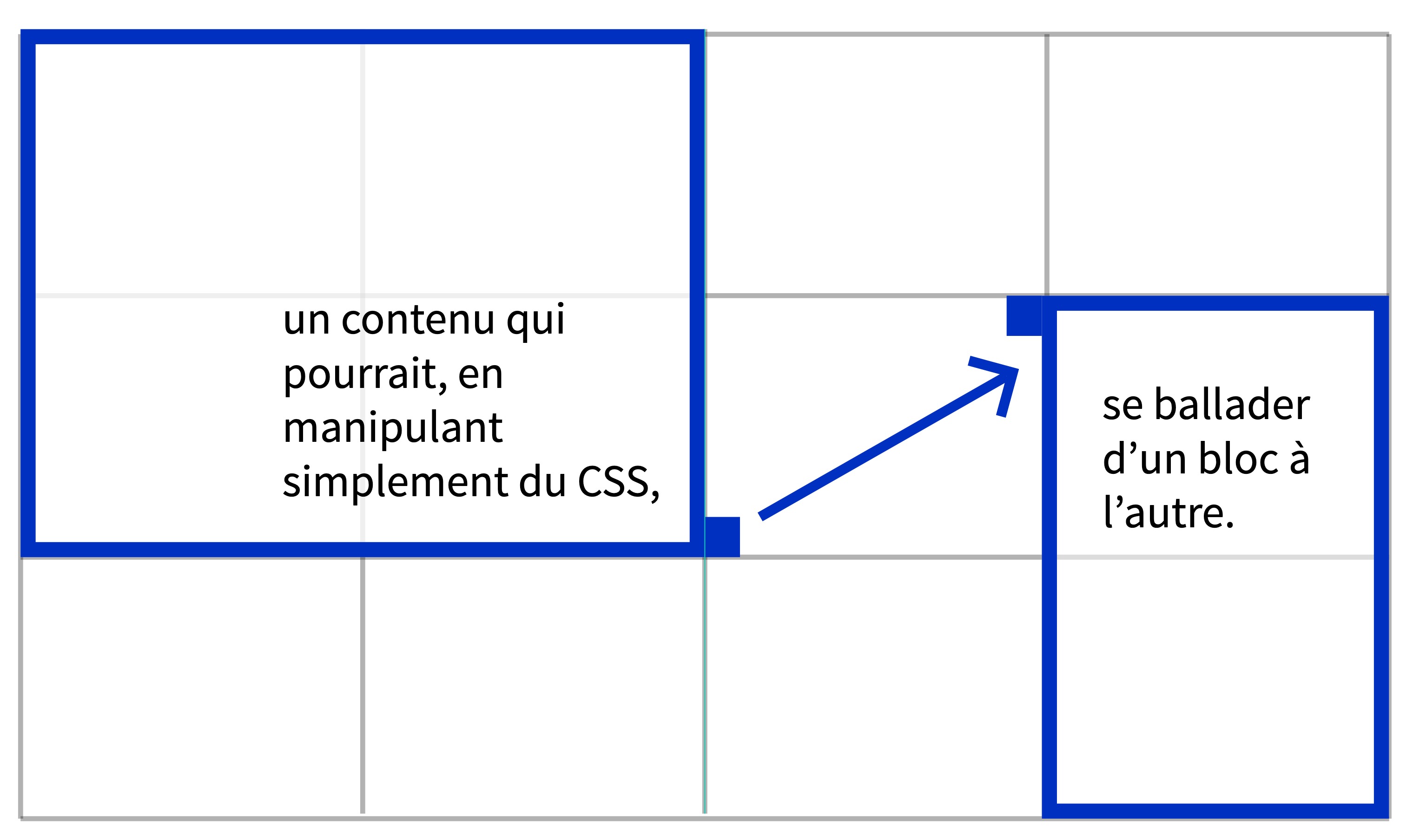
paged.js parallel-flows is a Paged.js plugin that allows you to define so-called parallel streams (in the absence of a better name). The idea is to use CSS to define streams that will share a space, whether it is a page (several languages on the same page), or a double page (where each language has its own page).
It looks like this:
To do this, we use a custom CSS property we made, called --paged-parallel-flow. This property expects for value the name of a stream that will serve as an identifier. All elements that have the same value for this property will therefore be part of the same parallel flow.
Take this HTML for example:
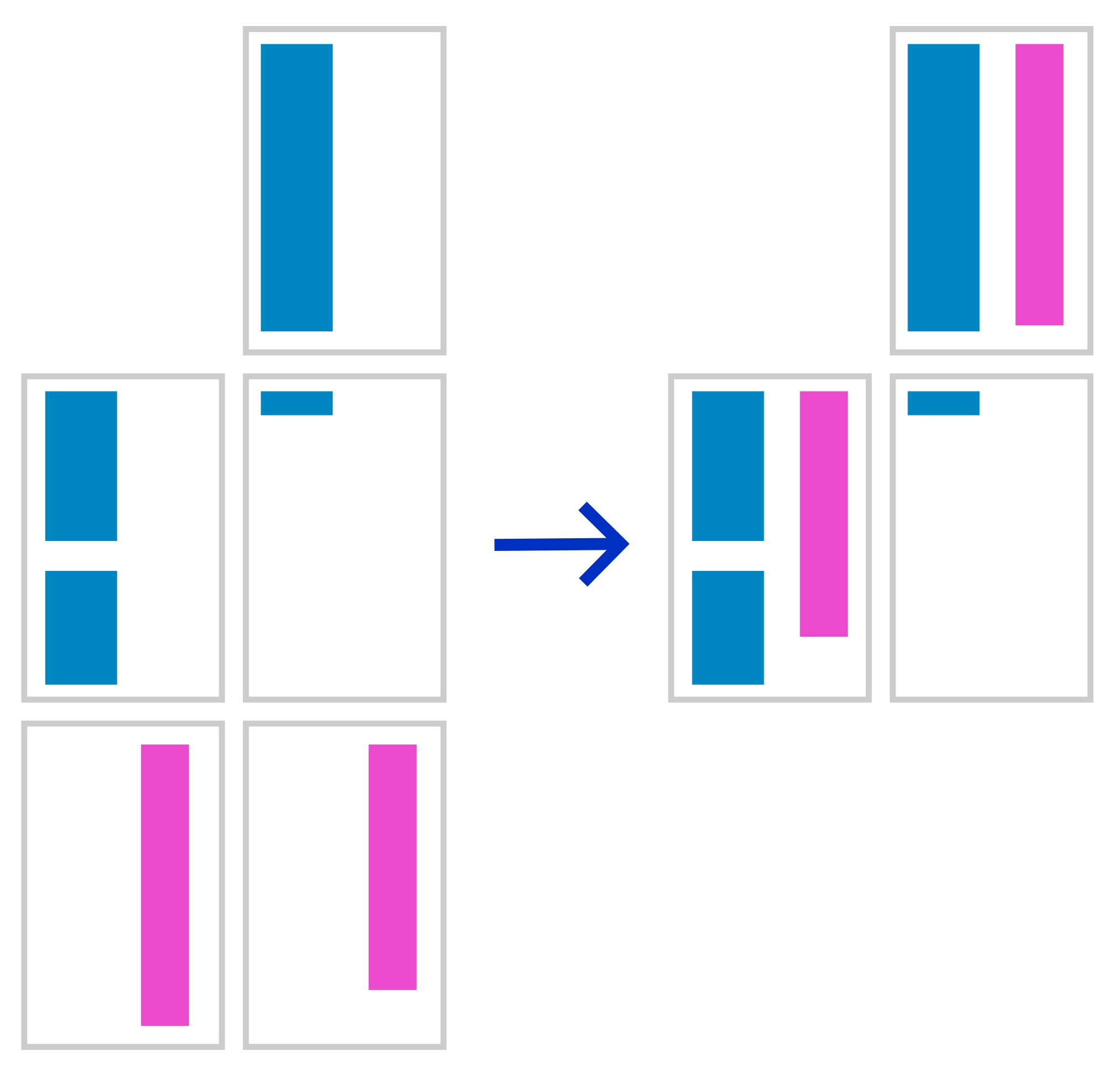
<section id="alpha">content</section><section id="beta">content</section><section id="delta">content</section><section id="epsilon">content</section>and this CSS:
#alpha {
--paged-parallel-flow: hand;
width: 30%;
}

#beta {
--paged-parallel-flow: hand;
width: 65%;
margin-left: car;
}

#epsilon {
--paged-parallel-flow: else;
width: 45%;

}

#delta {
--paged-parallel-flow: else;
width: 45%;
margin-left: car;
}
Note that each element already has investment properties: #alpha has a 30% width of its parent, #beta 65% and will be placed to the right, thanks to the use of margin-left: auto. The blocks defined here are therefore the locations of the containers as much as the contents.
#alpha and #beta must be treated at the same time and share one space, #epsilon and #delta share another.
The configuration of javascript
The javascript expects a specific configuration that informs about the type of flow and the choices of its implementation
The type of flow:
samepage: streams share the same pagessamespread: streams share the same double page
this.flowLocation = "samespread";or
this.flowLocation = "samepage";In the case of streams that would be configured to use samespread, you can automatically add a blank page if the streams are not of the same length.
this.flowSpreadAddWhite = true;What's happening.
-
Paged.js finds the starting point of each flow and marks the first element as the starting point of the parallel flow.
-
Paged.js draws the two elements by following the CSS rules, to find the longest. This then becomes the main flow of this stream, and it is moved before the first element of the stream. Secondary streams are sent all at the end of the content to be processed in a second time.
-
Once the entire content has been paged, Paged.js finds each main stream and returns the secondary stream elements to the same pages (or adjacent pages in the case of a
samespread), before deleting the pages that are now empty. Note: if it is asamespread, the pages are directly moved.
Bonus, an experiment.
Sometimes the main stream contains images. And it is not uncommon to want these images to exceed the width of text, without necessarily encroaching on the space needed for another stream. For this, we use --paged-parallel-impact: all. This experimental feature allows the main flow elements to impact the formatting of secondary flows. One case of use: an image dressed in the first stream, could dress the second. From a technical point of view, an invisible floating element is added at the beginning of this secondary flow, on the page or element A exists. This new item can be selected in CSS.
It is possible that the position of the added element is not correct, which is why it is possible to add the necessary changes to the css. To do this, you need to find the element identifier and add -overlap to your id.
For example:
#porco {
--paged-parallel impact: all;
}
To modify the manufactured overlap element, e.g. in the #alpha secion:
#alpha #porco-overlap {
width: 350px!important;
}
--paged-parallel impactworks only if the image is in the main stream, since it is it that is set up before the others, and therefore cannot be modified thereafter. Reminder: the main stream is automatically detected, it is the most
long (taking into account objects and images). To do this, the script makes a first layout pass before sinking the content for good.
One last thing
Raphael, who’s testing the implementation is a smart mind, and like all developper as some very existencial issues, like: how to not have to redo the whole html to break the content is smallest bit to make sure they can be correctly set on the pages.
So he came up with the idea of parallel-sync. If you have two pieces of content you want to show next to each other, and they’re both one long string of HTML, you can use another custom property.
.en,.fr {
  --paged-parallel-flow: alpha;
}
h3{
--paged-parallel-sync: alpha;
}
So if you have h3 in the different flows, they’ll wait for each other to start on the same page.
If you want to take a look at the code, it is here: parallel-flows. As i’m writing this, we’re on version 0.1d, working with paged.js 0.4.3 and 0.5b