This page is only available in English. If you want to help us translate, you can open an issue on Github and we’ll guide you through the process. Thank you!
Creating Templates is a series of articles in which one designer will explain the choices they made for a collection or a book, following the process from the typical design workflow to the output in modern typesetting using Paged.js. For the first article of the series, we’ll look at how Julien designed a template to be used in Editoria by Atla Open Press.
Established in 1946 as the American Theological Library Association, Atla is a membership association of librarians and information professionals, and a producer of research tools, committed to advancing the study of religion and theology.
Atla Open Press publishes open access books, journals, and other serials that cover subjects at the intersection of librarianship and religious and theological studies. Their books help to shape, guide and support innovative library services and enhance professional development for theological librarians and the field of religious studies.
Atla is moving its publishing workflow toward using Editoria, the community-driven platform to make books that Coko is working on. As early adopters of Editoria, Atla are an example of how you can change your publishing workflow by giving more space to collaboration with anyone involved in the making of the book. As part as their collaboration with Coko, Julien worked with the folks at Atla to design a template to be used in Editoria, ready to be used with Paged.js. Atla have now offered the template back to the community with an open source license (the template will be released soon).
The physical book
The primary form of the books published by Atla Open Press is digital: epub and PDF made for the screen, and the books are downloadable from their website. But the books are also produced as printed material, using Print On Demand services (or personal printers).
When the team started to work on the template, we explored an array of potential final output sizes for the book, and eventually we decided to go with a standard 6 × 9 inches (15.2 × 22.8 cm). Following the standard reduces the risk of errors when working with different printers, and if the reader needs to print the document at home, it’s pretty easy to put 4 pages per sheet of paper, reducing the waste without losing too much readability.
Once you have the size of your book, you’re ready to work. But what happens next is never a nice and easy sequence of steps to follow. It’s more like a series of trails and paths that we follow at the same time: fonts, font-size, leading, margins, etc. This production process is where the tension between aesthetics and readability has to be taken into account.
The first step is to figure out the number of characters which can be put on a page. The number of characters per line is the element that will determine a great part of the layout, so it needs to be carefully considered. Most books for scholars allow for more than the 55/65 characters per line usually advised for ebooks. With that in mind, letter choice can begin..
The typefaces
Typesetting is the act of putting letters on paper in a way that gracefully mixes legibility and aesthetics. Therefore, it starts with drawn letters. Always.
Here is a useful checklist:
- Remember the kind of letters you’ll need to work with.
How many of letters outside of the Latin glyphset will you need? Is your content only English, or do you have letters from extended Latin, or Greek? What about Cyrillic? Does it include a section of an old transcript from oral languages that has just been included in the Unicode? Since the books Alta publishes are about theology and religions, it’s not gambling to say that there will be a lot of non-English characters.
- Remember every member of the family you’re going to need
Sometimes you need to emphasise one part of the text, or show that a word has a different meaning or comes from another language. While an emphasis is not always set as italic, that has become over the year a kind of a standard: the em HTML element for the emphasis is by default an italic in almost all browsers.
Therefore, Roman letters are not enough for this template. So you need to be sure that the letters will have those styles available. Italic is the minimum. Bold is seldom used for emphasis in ebooks as it’s often not subtle enough, but it’s always useful to have that option for headers and structure.
- Remember the type color
Whatever font you choose, you’ll need to have the right balance between white and black on the page (ie the type color). That balance depends on how the type is set up: the drawings of the letters, the number of characters per line, the options for the justification: spacing, kerning, the width of the white space, etc. Depending on the content, you may want to have a darker feeling, that your page is filled with content, or you may want to be precious and have a lot of white space, giving a feeling of luxury. A good type color is one that is not too black, not too white, and dynamic enough to never feel grey.
- Remember that the look of the book is different than the experience of the book
I think that Tarantino said once that he never watched a movie without knowing it was a movie. I can say that I have never read a book without knowing it was a book: my designer’s eyes always get the over all feeling first: the type color, the font chosen, the margins, the alignments, etc. I understand the book before I start reading it. But here is the trick: a book can feel well designed and perfectly crafted, but the experience you’ll get from its reading may be different. So don’t forget to print and test and have a good look, print again, check again, until you’re happy with the feeling as much as the look.
Choosing the right fonts
As a designer, I used to follow every link that led to a new typeface or a new foundry. I bought fonts just because I liked their look even if I had no clue about how I would use them. So I got to look at fonts all day long, teaching my eye to look for specificities and to remember the feelings those could give. Choosing a font is all about finding the tiniest bit of the letter that will give the first impression on the book.
In Atla’s case, my first idea was to look at the classics. Going with a well-known letterform will give a sense of trust and truthfulness. But at the same time, I wanted to find something that was representative of the personality of the publishing house. Warm and friendly. Serious and friendly, the people you want to work with. And then also, there is the need for the font to support a wide range of letters and glyphs, and that’s generally the place to start.
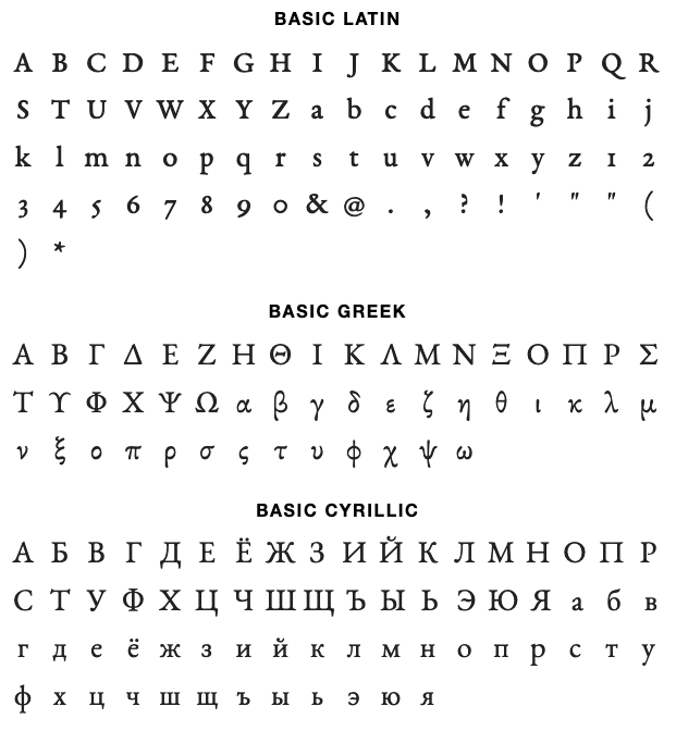
I started by looking at what I knew would answer that question, first choice being the Brill typeface, designed by the folks at Tiro Typeworks. Significant factors were firstly, because it supports Latin, Greek and Cyrillic, and secondly because each letter has been designed with care. However, you can’t really use that font for an Open Source project: as the Brill end user license agreement specifies that the font can only be used in a non-commercial environment, so that rules out using it for Atla.
Thankfully, over the last 20 years, there has been a lot of movement in the world of open source type foundries, and there is even a specific license, the SIL Open Font License (OFL), in use since 2005. I decided to investigate what the foundries offered, and I have spent a good deal of time finding what is available and identifying what would be a good fit for Atla.
The font library is often a good place to start looking for open source fonts. It includes a CDN that let you test your fonts in your files without having to build any @font-face functions. Language support generally needs to be a priority especially for as much of the Latin as possible, and the more languages the better, starting with Greek and Cyrillic, as they are often designed with the same tools and movements as Latin is designed with. Most of the time when you look at your content, the letters coming from another language will fit right in place.
EB Garamond
First, the classic of the classics, the Garamond, but the one under OFL licence, EB Garamond. The glyph set and the open-type features are quite interesting. These are in optical sizes: you wouldn’t use the same glyphs for a text set in 12pt or for a text set in 10pt, which is a tremendous work. But there is one caveat: there is no bold, so that would leave less options for the headings structure.

The other issue with the Garamond is the hardness of its shapes: the plume and the calligraphic gesture behind the letters survived in the digitization of those letters. While this adds a lot of authority to the letters, it doesn’t give the warmth and kindness I am looking for.
Noto Serif & Linguistics Pro
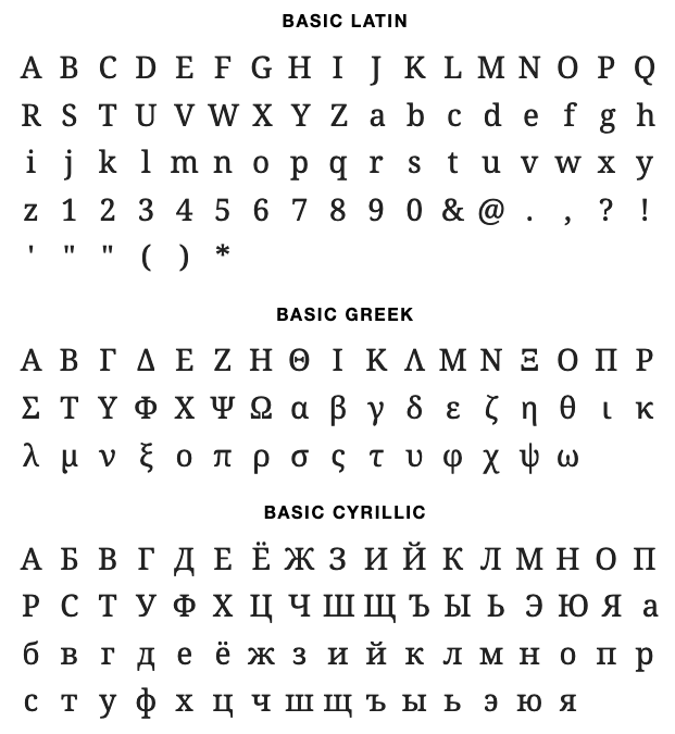
Noto fonts is an attempt from Google to have one super font family that supports all languages ever written with the same look and feel. While this seems to be an impossible task, Noto fonts already supports a wide variety of languages, which makes it a pretty good starting point to show international content. For example:

A font is like a color: it carries a lot of feeling in itself, but to have the most complete overview of its specificities, you need to compare it with another. So I you need to check the foundries.
The other font I looked at was Linguistics Pro, the most recent take on the Utopia Nova. The story of those letters goes back to 1989 when Robert Slimbach designed the font for Adobe and licensed to the TeX Users Group (TUG) for free modification and redistribution. Over the years, it has evolved to include polytonic Greek, modern and traditional Cyrillic, Vietnamese, among others, and was re-released in 2016 by Stefan Peev. It includes italic, bold and bold-italic, which is useful for headings.

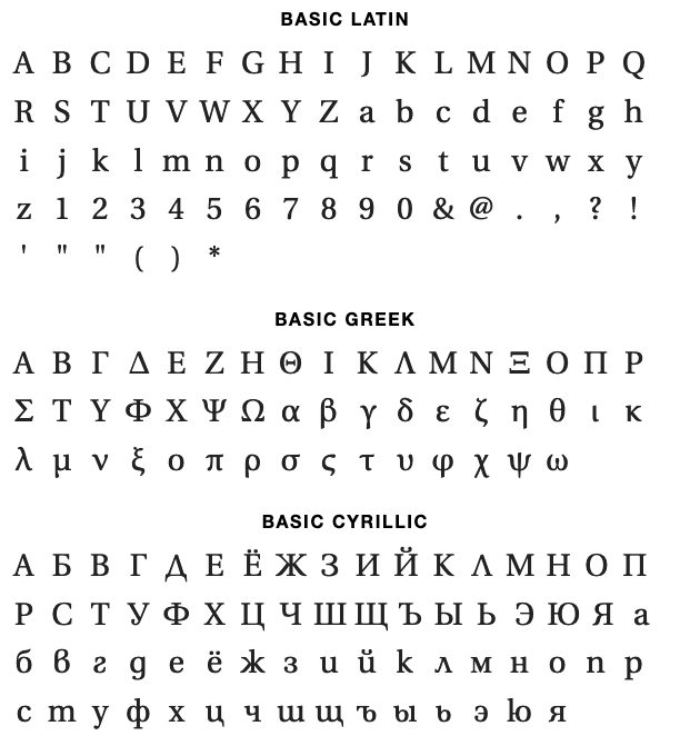
While the two fonts feel close over all in look and feel, they turn out to be very different when you inspect them carefully:

Noto Sans is more friendly than Garamond or Linguistics. It’s a modern serif that brings back a lot of manual gestures: the terminals of the f, r or capital S are all about calligraphic feelings, while the mechanical serifs are all about math and geometry. Those two characteristics are pretty useful when it comes to sharing shapes between letters from different parts of the world.
Linguistics Pro, on the other hand feels less modern. It’s based on a character that could have been released at the end of the 18th century when typographers were slightly moving away from their calligraphic roots to enter the world of rationality that was coming. Thus, we can find in those font characters, the characteristics of a scientifically drawn letter and the humanity of rounded serif terminals, never being sharp: a friendly but trusty face.
The last step is checking the fonts in context of a real paragraph, using text you can actually read, and no lorem ipsum placeholders.
The sizes of the letters are different: the Linguistics Pro family has a bigger ratio between the ascenders and the x-height than Noto. This gives a lighter feeling: the text will need less leading to achieve a good type black, and we’ll have more lines of text per page, which is a huge win when it comes to monograph books: reducing the amount of paper needed without losing readability is the real thing we’re trying to achieve.

So let’s try Linguistic Pro first, and we’ll see if we need to change later on.
Spoiler: it works fine.
The next article of the series will be all about the amount of content we can put on a page, defining margins, headings, and page types. See you all very soon.